How do you read the Fed's dot plot?
One dot per official, four times a year. Count the dots against the range in force the day they were drawn, and read the median last.

The short answer: The dot plot is a chart the Federal Reserve publishes four times a year, with one dot for each official showing where that official thinks the federal funds rate should sit at the end of each year. Read it by counting the dots against the range in force on the day it was drawn, then comparing it with the last plot, and never as a promise.
This week gave two plots to practise on. Wednesday's letter read June's, whose median sat on a row with no dot on it. Thursday's set it beside September's, drawn the day the Fed raised its range to 3.75–4.00%.
What the dot plot is
It is Figure 2 of the Summary of Economic Projections, the forecast pack released after four of the Fed's eight meetings a year. The note under the chart reads: "Each shaded circle indicates the value (rounded to the nearest 1/8 percentage point) of an individual participant's judgment of the midpoint of the appropriate target range" at the end of each year and over the longer run. Two words in that sentence do the work. "Participant" means everyone at the table: the Board's governors and all 12 regional bank presidents, although only 12 of them vote in any one year. "Appropriate" means each official's own view of the right policy, resting on that official's own forecast, not a plan the committee agreed.
The chart is younger than it looks. The Fed's own timeline dates it to 25 January 2012, when a figure "informally known as the 'dot plot'" first appeared, and the median was only added on 17 September 2015. The current medians, 4.1% for the end of this year and of next, are a public series: FRED on the Data Catalog.
How to read one, in three steps
Count before you average. The Fed defines the median, when the count is even, as "the average of the two middle projections". With 18 officials that is the ninth and tenth dots. In June it produced 3.75%, a row where nobody sat: eight dots at 3.625% and nine above. A median can describe a committee split almost down the middle.
Turn levels into moves. A dot is a level, not a count of rate changes. Start from the midpoint of the range in force when the plot was drawn and count quarter points. Against September's midpoint of 3.875%, a dot at 4.125% is one more rise and 4.375% is two. June's dots need June's midpoint, 3.625%, so the eight dots there meant no change at the time, not a cut.
Compare plot with plot. The news is usually the shift. Between June and September the median for the end of 2026 moved from 3.8% to 4.1% in the Fed's rounded table, and the lowest dot rose from 3.375% to 3.875%.
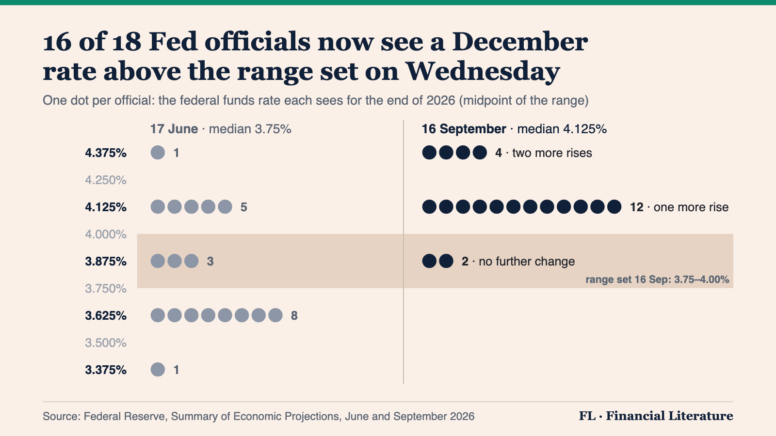
How to read this: the shaded band is the range the Fed set on 16 September. Read the right-hand column against it: two dots inside the band mean no further change by December, twelve a quarter point above mean one more rise, four half a point above mean two. Then read the left-hand column against June's own range, 3.50–3.75%, not against the band, or June's plot will seem to show cuts that nobody pencilled in. Only two meetings are left this year, 27–28 October and 8–9 December, so the right-hand column is a set of opinions about what those two meetings should do.
What it is not
It is not a promise, and the record is plain about that. In December 2021 the median official saw the rate at 0.9% by the end of 2022. The Fed then raised seven times in 2022 and finished the year at 4.25–4.50%. Each dot rests on a forecast, and when the forecast changes, the dot moves.
It is not a vote either. Presidents who do not vote this year still submit dots, and on Wednesday a 12–0 decision sat beside dots spread across three levels for December. And the median is not the committee's view. It is the view of the officials in the middle, and it can land where no official stands.
The habit
Count, convert, compare: count the dots, convert each into moves from the range in force that day, and set the plot beside the last one. We practised on Wednesday and Thursday. The projections measure inflation with PCE, the gauge last Saturday's explainer set beside CPI. The archive keeps the daily series.
Financial Literature is for educational and informational purposes only. Nothing here is investment, financial, legal, or tax advice, or a recommendation to buy or sell any security. Content is impersonal and not tailored to any individual. Data may contain errors, so verify before relying on it. We explain; we never advise. Sources: Board of Governors of the Federal Reserve System, Federal Reserve Bank of St. Louis (FRED).
Forwarded this by a friend? Subscribe here. Found it useful? Forward it to one person who'd want it.
— The Editorial Team