What is the Bank of Korea's dot plot, and why does it matter more than the rate decision?
Seven rate-setters, three dots each, six months ahead. How to read the pile, the median and the shift, and what the dots are not.

The short answer: the Bank of Korea's dot plot is a chart of where its seven rate-setters each expect the base rate to be six months from now, drawn as anonymous dots. Markets watch it because the rate decision tells you what the bank did today, while the dots tell you what it thinks it will do next, and prices move on the second.
What the dot plot is
The Bank of Korea sets the base rate, the interest rate that anchors what Korean banks charge each other overnight and, further down the chain, mortgage and deposit rates. Eight times a year the seven-member Monetary Policy Board votes on it. Four of those times, in February, May, August and November, the board also publishes the "K-dot plot", introduced on 26 February 2026 to replace an older three-month guidance that critics found too vague.
The mechanics matter. Each of the seven members places three dots, not one, so there are 21 dots in all, and each dot marks a rate level the member considers plausible six months ahead. The dots are anonymous. The format is borrowed from the US Federal Reserve, which has published its own version since January 2012, with one difference: Fed officials place one dot each, Korean members place three. Three dots let a single member express a range ("3.00% if inflation cools, 3.25% or 3.50% if it doesn't") rather than a point.
Who tracks it, and why
Bond traders first. The yield on Korea's three-year government bond is, roughly, the market's own six-month-to-three-year forecast of the base rate, so the dots and the bond yield are two drawings of the same question by different people. Currency traders second: a bank expected to raise rates tends to support its currency, so the won reads the dots too. Households last but not least, because the dots are the closest thing to a published hint about where mortgage rates are heading.
In each case the value of the dots is the same. A rate decision is usually priced before it happens; on 27 August the hike to 3.00% was expected by nearly everyone, and the index opened higher on Nvidia's results rather than on the bank. What was not priced was the distribution of the dots.
How to read a move
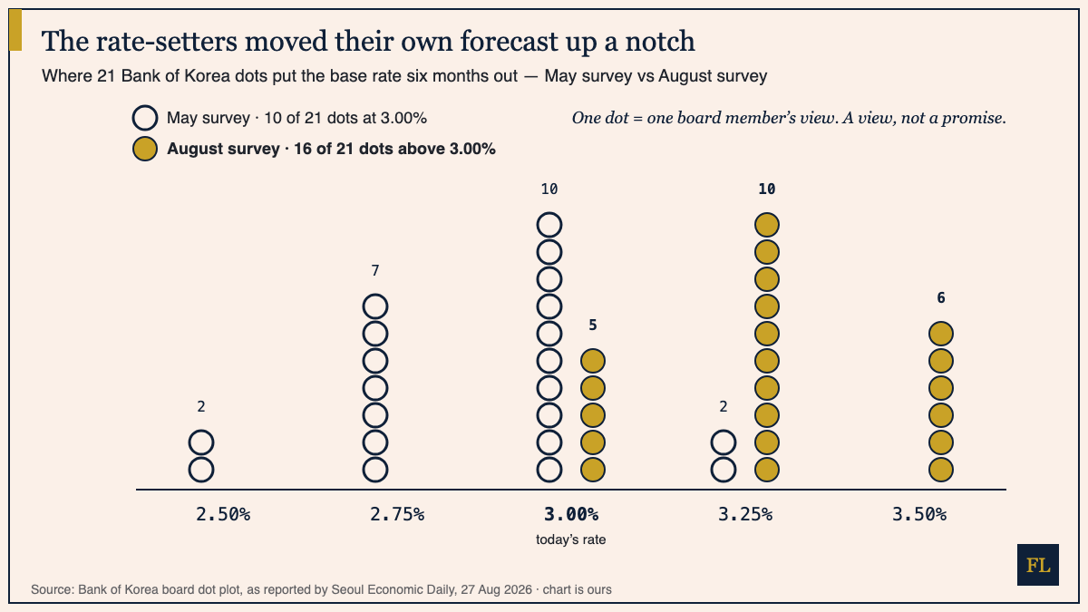
How to read this: hollow circles are May, gold are August; each column is a rate level, each circle one dot. Don't look for a line, look for the pile. In May the tallest pile sat on 3.00%; in August it sits on 3.25%, with a new pile at 3.50%. That shift, not any single dot, is the message. Then compare the piles to the actual rate: 3.00% today, with the August piles already above it, which is what the three-year bond yield had been saying, drawn by different people.
The three readings, in order of usefulness:
- The median dot. Sort the 21 dots and take the middle one. In August it was 3.25%, which Governor Shin Hyun-song described as "around one more rate increase from the current level". The median is the one-number summary the wires print.
- The pile against the rate. Count the dots above, at and below today's rate. In August, 16 of 21 sat above 3.00%, five at it, none below. That count is the direction of travel.
- The pile against the last pile. In May, ten of 21 dots sat at 3.00% and seven at 2.75%. Three months later the tallest pile had climbed a full quarter-point. The movement between plots is the news; the level of any one plot is mostly already in prices by the time you read it.
What the dot plot is not
It is not a promise. Every dot is one member's view on one day, conditional on the data they had. The first K-dot plot, in February, put 16 of 21 dots at 2.50%, signalling a long hold; by May the tallest pile was at 3.00%, and by August the rate had actually reached 3.00% with the pile at 3.25%. That is not the tool failing. It is the tool showing you how fast the picture changed.
It is not a vote, either. The August decision passed 6 to 1, but the dots are not the same six and one. A member can vote for today's hike and still place dots at 3.00% for six months out. And it is not a schedule: the governor said every remaining meeting this year is a "live meeting", which is central-bank language for "we have not decided".
The habit to build is the same one we practise every weekday: when a dot plot lands, ask three questions. Where is the median? How many dots sit above the current rate? And where was the tallest pile last time? Then look at the three-year yield in the dashboard and see whether the bond market agrees with the board. If it doesn't, one of them will move.
The archive keeps the daily series, dot plots included.
Financial Literature is for educational and informational purposes only. Nothing here is investment, financial, legal, or tax advice, or a recommendation to buy or sell any security. Content is impersonal and not tailored to any individual. Data may contain errors — verify before relying on it. We explain; we never advise. Sources: Seoul Economic Daily, The Korea Herald, Korea JoongAng Daily, investingLive, Federal Reserve Board.
Forwarded this by a friend? Subscribe here. Found it useful? Forward it to one person who'd want it.
— The Editorial Team